Introduction
Back to user guide contents list
SCoT is a scholarly software for the graph-based analysis of distributional semantics over time. There are many use cases. SCoT has been utilized, for example, to unearth the changing meaning of “network” from the medieval ages to the digital era. [Friedrich, Biemann 2016]

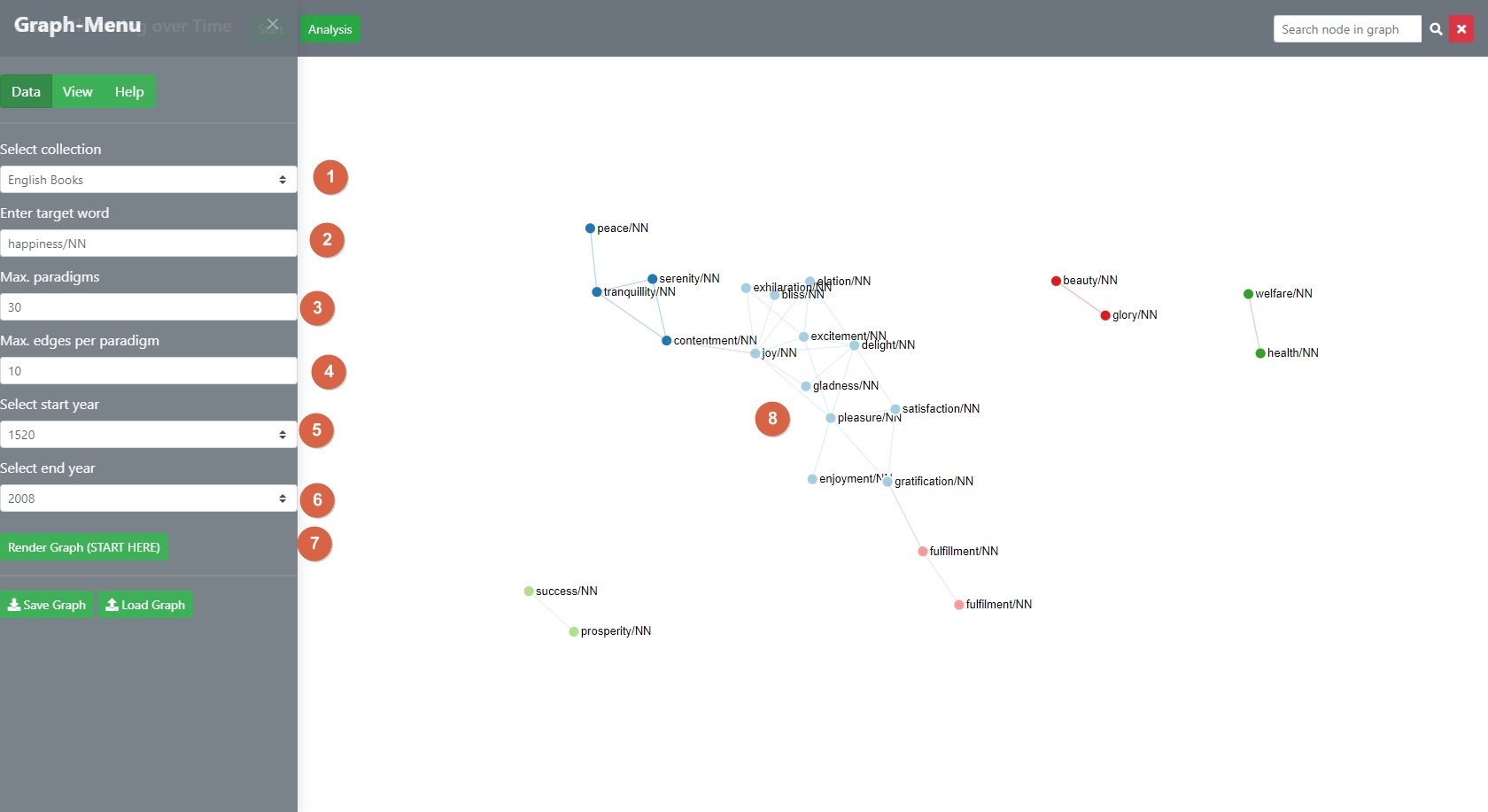
The user starts the programm by selecting a precalculated corpus [1] and a target-word [2]. The metrics have been precalculated by the Language Technology Group with the help of the JoBim-Framework [and in the case of Google Books by Google]. The main task of SCoT is to analyse these metrics with a clustered graph[8]. The user can control the size and density of the graph with two parameters, the maximum number of (most) similar words to the main target-word [3] and the density of the interrelations. [4]
Scot then chooses the most similar words across all time-slices. The key to the analysis is the global threshold of paradigms [nodes] and their interrelations [edges] that is set by the user. This global limit determines which nodes are considered “born” or “dying” across the selected time-slices [5,6]. Each corpus comes with a pre-set of the parameters but it is highly recommended to try out various parameters to get a “feel” for their effect. The graph is created by clicking “Render Graph” [7].

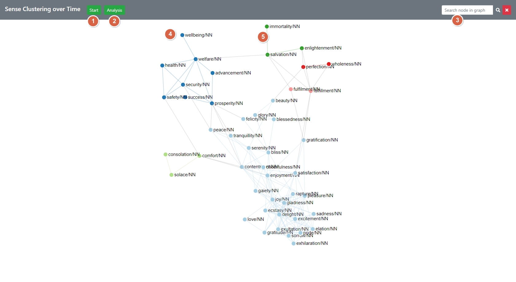
The picture above shows the general structure of the web page after a graph was rendered for the query “happiness/NN”. The resulting graph displays the maximum-values across time-slices. The time-slices can be gathered from the tool-tips of the nodes [4] and edges [5] and can also be visualized in various ways in the time-diff mode. After the initial graph has been calculated by SCoT, the user can edit and correct clusters in different ways. Most of these functions are available via the three main ways of interacting with the application:
[1] The Start-Button slides out the Graph-Menu on the left which enables the shaping of the graph and the editing of the view settings that shape the display of the graph.
More info on the settings sidebar
[2] The Analysis Button - brings up the cluster analysis section with the time-diff mode on the right-hand side.
More info on the analysis options
More info on the time-diff mode
[3] The nodes and edges of the graph provide tooltips, can be dragged, rearranged, deleted and can be clicked for contextual information.
More info on the interaction with the graph
More info on the contextual mode